• MS-DEFCON color scheme sends no message

    Author
    Topic
    #2376327

    Susan:

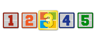
    The color scheme for MS-DEFCON sort of looks like my flower garden, but it conveys no message corresponding to the five conditions. Here is a suggestion:

    The first three conditions should be in RED (you know, like a traffic light) with “1” in the brightest color and then shading or lightening down to PINK for DEFCON “3.”

    Then switch the current GREEN in DEFCON -4 to DEFCON-5 and use a bright yellow for DEFCON-4.

    Almost no one would misunderstand the meaning with a scheme like that and readers would almost certainly process the information much faster than mentally trying to recall exactly what each DEFCON condition means. The definitions and numbers wouldn’t be changed, of course, but changing the colors would convey the sense of each condition.

    • This topic was modified 3 years, 10 months ago by MikeyD215.
    3 users thanked author for this post.
    Viewing 2 reply threads
    Author
    Replies
    • #2376344

      Agree on the new MS-DEFCON design. Why did it need to be changed in the first place? The old design was perfect, orked great for years, and the new one just creates confusion. However, on the suggested color changes, yellow belongs on 3, as that level is “proceed with caution”.

      1 user thanked author for this post.
    • #2376461

      This thread made me pay more attention to the current design. In doing so, I found the levels to be much more distinguishable than in the old design. I also noticed how it is now much closer to the colors used by the US armed forces, when previously it wasn’t (yes, I used the Internet Archive to verify my memory).

      My 2¢: With a name that includes the term “DEFCON”, the current color scheme is correct. I don’t imagine that name will be changed anytime soon, so I’m fine with how it looks now.

      1 user thanked author for this post.
    • #2377289

      As a person who is red-green colorblind (and there are many of us), neither the new nor the old color scheme made any sense.

      I agree with the idea behind poster who suggested a range of colors from bright, dark red at 1 to something like the green of a Go traffic light at 5.

      Apart from color, for me a 1 in a signaling system has always meant a low level of importance, where a higher number would mean greater importance.  This is reinforced by the countless surveys with which the generation that never knew anything about nuclear war danger signaling has been inundated.

      So I find DEFCON 1 being the most severe anomalous and confusing.  (I don’t know whether or not I am an outlier in this regard)   But I do understand the desire to mimic the nuclear war danger alert system, given the real danger of disruptive updates.

      But the ultimate solution to all of this would be to just add two words on the logo: NO to the left of the 1, and YES to the right of the 5.  Then you can use whatever color scheme your heart desires, while the message is unambiguous.


      — AWRon

      1 user thanked author for this post.
    Viewing 2 reply threads
    Reply To: MS-DEFCON color scheme sends no message

    You can use BBCodes to format your content.
    Your account can't use all available BBCodes, they will be stripped before saving.

    Your information: