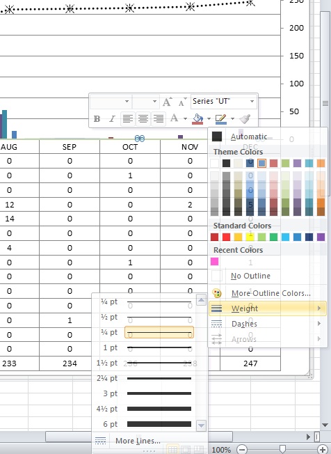
I have a bar chart in Excel 2010 that has 14 lines in it.
The first 11 lines have thick lines in the chart, the last 3 have thinner lines. I want to make them all the same weight.
I cannot find a way to do this.
Also, the first 11 do not seem to have all of the same attribute choices available that the last 3 do.
I inherited this spreadsheet with the chart and added those last three lines to the table.
Anyone know how I do this?
Thanks,
Jeff

|
Patch reliability is unclear. Unless you have an immediate, pressing need to install a specific patch, don't do it. |
-
Need to change lines in Excel 2010 chart
- This topic has 10 replies, 3 voices, and was last updated 12 years, 3 months ago.
AuthorViewing 5 reply threadsAuthorViewing 5 reply threads

Plus Membership
Donations from Plus members keep this site going. You can identify the people who support AskWoody by the Plus badge on their avatars.
AskWoody Plus members not only get access to all of the contents of this site -- including Susan Bradley's frequently updated Patch Watch listing -- they also receive weekly AskWoody Plus Newsletters (formerly Windows Secrets Newsletter) and AskWoody Plus Alerts, emails when there are important breaking developments.
Get Plus!
Recent Topics
-
Moving fwd, Win 11 Pro,, which is best? Lenovo refurb
by 2 hours, 39 minutes ago
-
DBOS Advanced Network Analysis
by 8 hours, 25 minutes ago
-
Microsoft Edge Launching Automatically?
by 2 hours, 16 minutes ago
-
Google Chrome to block admin-level browser launches for better security
by 11 hours, 6 minutes ago
-
iPhone SE2 Stolen Device Protection
by 3 hours, 21 minutes ago
-
Some advice for managing my wireless internet gateway
by 1 hour, 29 minutes ago
-
NO POWER IN KEYBOARD OR MOUSE
by 5 hours, 18 minutes ago
-
A CVE-MITRE-CISA-CNA Extravaganza
by 20 hours, 35 minutes ago
-
Sometimes I wonder about these bots
by 16 hours, 52 minutes ago
-
Does windows update component store “self heal”?
by 6 hours, 55 minutes ago
-
Windows 11 Insider Preview build 27858 released to Canary
by 1 day, 10 hours ago
-
Pwn2Own Berlin 2025: Day One Results
by 1 day, 9 hours ago
-
Windows 10 might repeatedly display the BitLocker recovery screen at startup
by 7 hours, 11 minutes ago
-
Windows 11 Insider Preview Build 22631.5409 (23H2) released to Release Preview
by 1 day, 13 hours ago
-
Windows 10 Build 19045.5912 (22H2) to Release Preview Channel
by 1 day, 13 hours ago
-
Kevin Beaumont on Microsoft Recall
by 1 day, 1 hour ago
-
The Surface Laptop Studio 2 is no longer being manufactured
by 1 day, 21 hours ago
-
0Patch, where to begin
by 1 day, 15 hours ago
-
CFPB Quietly Kills Rule to Shield Americans From Data Brokers
by 2 days, 11 hours ago
-
89 million Steam account details just got leaked,
by 1 day, 22 hours ago
-
KB5058405: Linux – Windows dual boot SBAT bug, resolved with May 2025 update
by 2 days, 19 hours ago
-
A Validation (were one needed) of Prudent Patching
by 2 days, 10 hours ago
-
Master Patch Listing for May 13, 2025
by 1 day, 21 hours ago
-
Installer program can’t read my registry
by 14 hours, 28 minutes ago
-
How to keep Outlook (new) in off position for Windows 11
by 2 days, 8 hours ago
-
Intel : CVE-2024-45332, CVE-2024-43420, CVE-2025-20623
by 2 days, 15 hours ago
-
False error message from eMClient
by 3 days, 6 hours ago
-
Awoke to a rebooted Mac (crashed?)
by 3 days, 15 hours ago
-
Office 2021 Perpetual for Mac
by 3 days, 16 hours ago
-
AutoSave is for Microsoft, not for you
by 14 hours, 33 minutes ago
Remembering Woody
